introduction
Your living room is more than just a place with sofas and a TV it’s the heart of your home. It’s where you relax after a long day, entertain guests, create memories with family, and sometimes even work or study.
Because of its central role, the color you choose for your living room walls matters more than you might think. Paint influences mood, perception of space, lighting balance, and even how comfortable people feel in a room.
In this extensive guide, we’ll walk through the 7 best paint colors for living rooms discussing why they work, how to pair them with furniture and décor, and how they affect ambiance and light.
Whether you want something calm and classic, warm and inviting, bold and dramatic, or modern and minimal, there’s a color here for every taste.
1. Warm Neutrals — Beige and Taupe
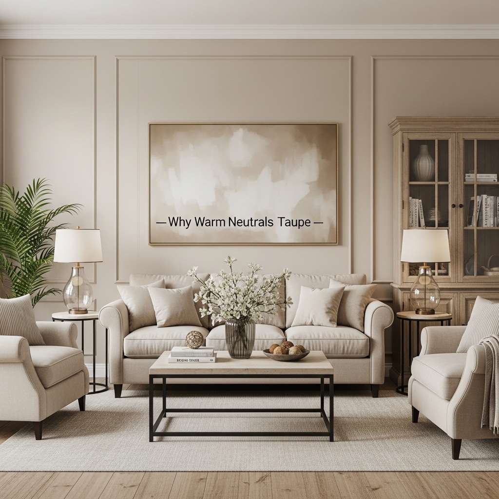
Why Warm Neutrals Work
Warm neutrals like beige and taupe are classics for a reason they’re versatile, timeless, and forgiving. These shades provide a neutral backdrop that complements almost any décor style: from traditional and rustic to modern and minimal.
They’re warm (unlike cooler greys that can sometimes feel cold) and help the living room feel inviting and comfortable.
Choosing the Right Tone
Warm neutrals range from light sandy beiges to deeper taupe shades with underlying grey or brown. To find the right one:
- Light beige brightens smaller spaces without stark contrast.
- Mid-tone taupe adds sophistication and richness.
- Deeper warm neutrals create a cocoon-like feel, perfect for cozy living rooms.
Pairing with Décor
Warm neutrals are easy to decorate around:
- Wood furniture and woven textiles enhance warmth.
- Metallic accents (like brass or gold) give a touch of glam.
- Bold patterns pop against neutral walls without overwhelming the room.
Best For
- Families and high-traffic living rooms
- Transitional and classic décor styles
- Rooms that need flexibility with furniture changes
2. Soft Greys — Sophisticated and Versatile
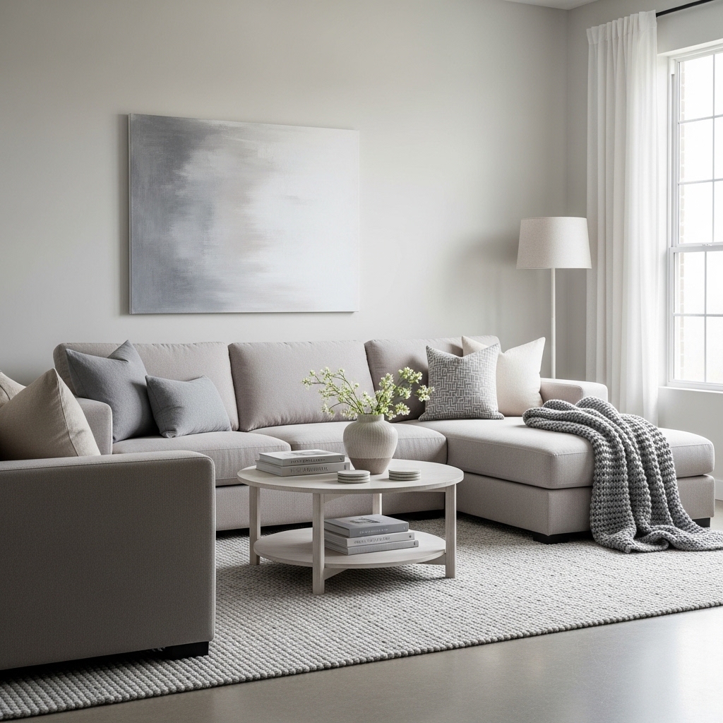
Why Soft Grey Is So Popular
Gone are the days when grey felt cold or institutional. Today’s soft greys are warm, inviting, and modern. They strike a perfect balance between neutral and chic, making them one of the most popular choices for living spaces.
Light vs. Dark Grey
- Light grey gives a clean, airy feel and works beautifully with white trim and natural wood.
- Medium grey can be grounding without feeling too heavy.
- Dark charcoal greys bring dramatic contrast and work well in rooms with high ceilings and plenty of light.
Decorating with Grey
Grey is a brilliant backdrop for bold décor:
- Accent colors like navy, emerald, mustard, and blush stand out.
- Textures such as plush rugs, velvet pillows, and layered fabrics add warmth and depth.
- Art and photography look striking against a cool grey backdrop.
Tips for Lighting
Grey’s undertones (blue, green, purple, or brown) show up under different lighting:
- Test paint samples on multiple walls.
- Observe during daylight and artificial light.
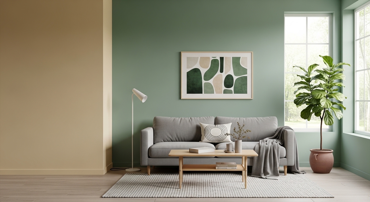
3. Earthy Greens — Calm and Organic
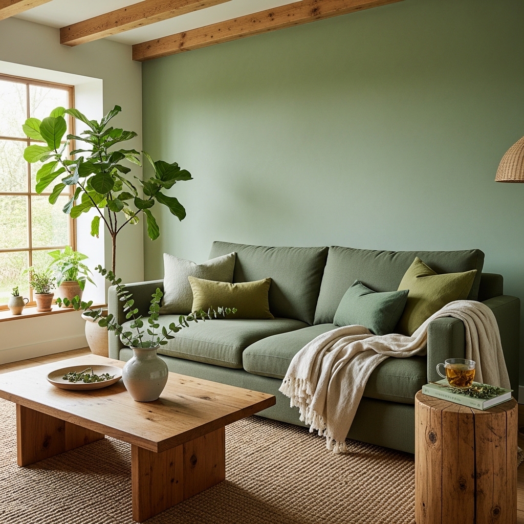
The Appeal of Green
Green connects us to nature, evoking calm, balance, and restoration. In a living room, earthy greens create a soothing retreat—especially when paired with natural materials like wood, stone, and linen.
Shades That Work
- Sage green is soft, subtle, and elegant.
- Olive and moss tones add depth and sophistication.
- Deeper forest green feels luxurious and enveloping.
Complementary Pairings
- Creamy whites keep green from feeling too heavy.
- Wood tones reinforce the organic look.
- Brass or matte black accents add modern contrast.
Best For
- Living rooms with lots of plants
- Nature-inspired and boho styles
- Spaces meant for relaxation and conversation
4. Warm Terracotta and Rust — Bold and Cozy
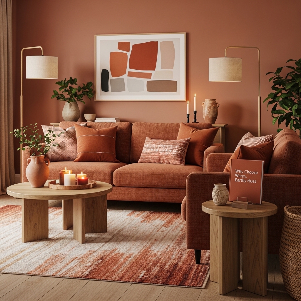
Why Choose Warm, Earthy Hues
If you want warmth with personality, terracotta or rust tones deliver. These colors bring energy and richness without overwhelming a space. They embrace warmth while grounding the room in a natural palette.
Creating Ambiance
Warm tones make a living room feel intimate and inviting—perfect for gatherings and evening relaxation. These colors reflect light softly, giving a glowing effect that’s comforting and welcoming.
Pairing Suggestions
- Creamy neutrals soften the boldness.
- Natural wood furniture complements earthy hues.
- Textured fabrics (like woven rugs or boucle chairs) keep balance and prevent the room from feeling too heavy.
Best For
- Living rooms with fireplaces or wood features
- Spaces with natural light that highlights warmth
- Eclectic or global-inspired décor
5. Classic White — Fresh and Timeless
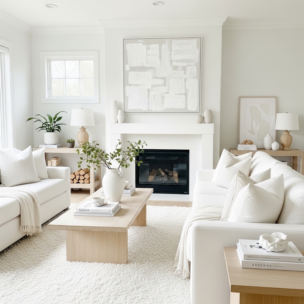
Why White Works
White is the ultimate blank canvas: it maximizes light, creates a feeling of space, and allows your furniture, art, and décor to take center stage. White living rooms feel calm, clean, and open. If you love minimalist design or have a small space, white is a powerful choice.
Selecting the Right White
Not all whites are the same:
- Warm whites with yellow or beige undertones feel cozy.
- Cool whites (with blue or grey undertones) feel crisp and modern.
- Pure whites can be striking but need good lighting to avoid feeling stark.
Decor Pairings
- Wood tones and greenery bring life to white spaces.
- Layered textures prevent white from feeling flat.
- Accent colors like navy, black, or brass enhance sophistication.
Tips for Success
- Use different shades of white (walls, trim, ceiling) to add dimension.
- Incorporate varied textures: ribbed, knit, woven, and soft fabrics.
Best For
- Small or low-lighting living rooms
- Scandinavian and minimalist interiors
- Art-focused spaces that need a neutral backdrop
6. Deep Blue — Elegant and Dramatic
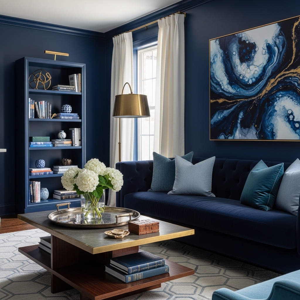
The Power of Blue
Blue is calming, confident, and versatile. Deep blues—such as navy or indigo—add drama and richness without feeling heavy or oppressive. They work particularly well in living rooms where you want a sense of depth and sophistication.
Style Match
Deep blue pairs beautifully with:
- Brass and gold accents for a glam look
- Natural wood and leather for warmth
- Creams and whites for balanced contrast
Light Considerations
Because dark blue absorbs light, use it in spaces with adequate natural or layered lighting:
- Pendant lights
- Floor lamps
- Recessed lighting
Decorating Tips
- Add artwork with metallic frames to play off the blue backdrop.
- Use textured fabrics like velvet or linen to add richness.
- Include lighter accessories to keep the room from feeling too dark.
Best For
- Formal or sophisticated living rooms
- Open-plan spaces with good lighting
- Interior designs with contrasting accents
7. Blush and Soft Pinks — Subtle and Stylish
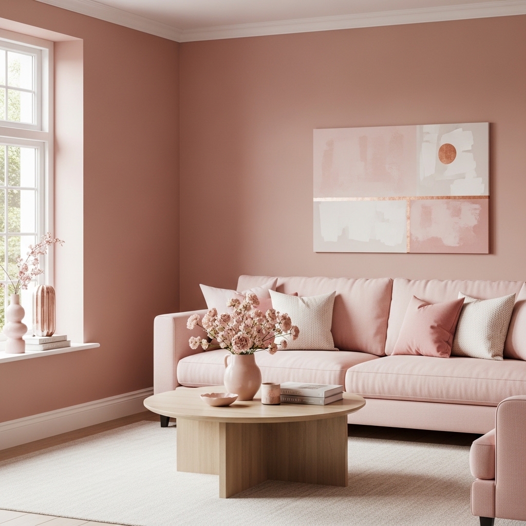
A Fresh Take on Color
Soft pinks and blush tones have moved beyond nurseries into elegant, modern living rooms. These subtle hues bring warmth, sophistication, and a soft glow that’s less traditional than neutrals but still easy to live with.
Why It Works
Blush shades add gentle warmth without feeling sugary or overtly feminine. They soften harsh light and pair beautifully with various materials:
- Warm metals like copper and brass
- Natural woods
- Green plants for freshness
Decor Ideas
- Pair blush walls with neutral upholstery for balance.
- Add contrasting accents like charcoal cushions or navy throws.
- Use artwork with warm tones to tie the room together.
Best For
- Creative, modern interiors
- Spaces seeking warmth with a twist
- Rooms with plenty of natural light
conclusion
In conclusion, choosing the right living room paint color can completely transform the look and feel of your home. The seven paint colors highlighted above offer a perfect balance of style, warmth, and versatility, making it easy to create a space that feels both beautiful and welcoming.
Whether you prefer soft neutrals, rich earthy tones, or subtle pops of color, the right shade can enhance your décor, reflect your personality, and elevate everyday living. With thoughtful selection, your living room can become a timeless, inviting space you’ll love coming home to.